What is Picture to People ?

"Picture to People" (P2P) is a huge Computer Graphics project. It was started to create new softwares able to make 2D drawing, 3D rendering, vexel drawing, text effects, photo effects, image filtering and other complex Computer Graphics operations. It has been made from scratch, including its low level Computer Graphics libraries like Maccala. Nowadays, most final features produced for this project are released as free online tools available from its official website. This blog talks about Computer Graphics, mainly concerning Picture to People development.

"Only who makes has true knowledge. Knowledge is control. True power depends on total control. Only who makes from scratch has the real power."

Showing posts with label vector library. Show all posts

Thursday, December 25, 2014

Researches about hair and fur drawing

Picture to People libraries are getting more and more advanced and complicated. Since some time ago, I'm researching about new realistic techniques to render some nature structures like fur and hair.

I'm developing my own exclusive algorithms and I have already got some advances. I could already create some code able to generate interesting fur and hair patterns.

Below you can see a letter "a" rendered by using the model I already researched to produce fur. There still are a long way to a production level software to create 3D fur text effects, but the effort has been worthy so far.
My algorithms don't cheat like some desktop graphic softwares that use brushes to create this kind of effect. The piece above was drawn using thousands of vector based hair structures created from scratch in rendering pipeline.

 Subscribe in a reader

Saturday, November 29, 2014

Developing new graffiti text effect makers

It has been some time I started researching and developing test software to create new way to produce killer graffiti text effects.

In fact, I'm trying to create a whole set of graphic functions to make easy to generate a new class of graffiti effects. A good part of these new functionalities already became a new part of Maccala, my full-featured vector based drawing library.

I was already able to make some nice advances, but I'm not satisfied yet. We already have the best online graffiti creator and I'm trying to create a complementary software with a similar strength and customization level. In fact, Picture to People site already has a set of online graffiti creator apps.

I'm also searching for ways to make this new graffiti generator somehow easier than the already released one. Below you see a graffiti effect generated with by using the new graffiti softwares I already coded.


 Subscribe in a reader

Saturday, June 29, 2013

An easy way to draw lighting bolts

Recently I was programming some stuff by using Maccala and some other P2P libraries. They are here to make Computer Graphics as easy as possible.

There was a moment when I needed to draw a vector lighting bolt symbol. What a boring task !!! It's harder than we imagine at a first sight. Twenty minutes after beginning this job, it was clear to me: I really wanted an easy way to make that kind of drawings we use to represent bolts.

I spent some time, but I created a method to generate any kind of lighting bolt. I made it so configurable as I could imagine, what turned the mission into something more complicated.

Maybe it doesn't look very interesting for you, but, from now on, I can save my fingers every time I need to render something like the drawings you see below. I prefer to work hard once, so I can be lazy many other times. :)


 Subscribe in a reader

Friday, June 21, 2013

More advanced arrow drawing styles and configuration

Since I released my vector based drawing library for the first time and started using it, there was many ways to draw arrows, because it already had very customizable methods to make it. You can even see a screenshot about it at the web page about Maccala's features.

Anyway, the library had some limitations, as for example: just straight arrows could be drawn and only using a chosen but fixed thickness for arrow body.

I have recently created more methods in my class responsible for drawing 2D vector based objects in a canvas, including methods to draw more configurable and generic arrows. Summing up the old and the new features, now arrow drawing tasks can take advantage of these main features:

- ability to draw straight or curved arrows;
- use of arbitrarily progressive arrow body thickness;
- use of highly configurable arrow head shape;
- ability to draw arrow head in both sides if desired;
- use of any RGB color;
- use of configurable high level anti-aliasing.

Below you see some examples of arrows created by using the new features I have developed.


 Subscribe in a reader

Wednesday, June 19, 2013

Drawing curves with progressive thickness

Here I show you one more recent improvement for my vector based rendering library called Maccala.

Now it's possible to create any kind of curve with an arbitrary progressive thickness. I guess it's kind of strange I have never developed this before, but I have never needed something like this until now.

Surprisingly, it was harder to develop than I imagined initially. It was needed to redevelop my algorithm responsible for creating a thick shape based on a Math curve (conceptually a curve has no thickness at all).

In fact, in a generic algorithm, even drawing operations (in this context, "draw" means "render the contours") are tackled as filling jobs. First an assembling algorithm constructs a shape with an arbitrary thickness, so a filling algorithm can render it.

Below you can see a curve drawn with variable thickness. Now it's possible to make something like this so easily as calling a method. Unnecessary to say, the professional anti-aliased rendering is still there.
 Subscribe in a reader

Saturday, June 15, 2013

Sub-pixel precision drawing for vector based render engines

I'm really impressed with the fine quality increase I got by improving the sub-pixel precision of my 2D render engine, which I use in Maccala library. I don't need to make any more some post-processing operations when rendering some complex text effects.

I have received some emails from colleagues asking about this change after I talked about this improvement here. They are CG developers too and were kind of confused about what I meant in my previous post about this subject called "Subpixel vector drawing with professional antialiasing".

First of all, don't be confused between "sub-pixel positioning" and "sub-pixel precision". In the first one, we know how to properly draw the bodies despite they can be in fractionary positions, but it doesn't mean we can draw bodies smaller in size than one pixel.

As an example, I borrowed an image from the webpage about Maccala's features. You can see many line segments with a progressive thickness. All of them are positioned in sub-pixels positions, but just the first one is thinner than one pixel (its thickness is 0.5).
In fact, the real elegance of my algorithm is that it had always been ready to draw shapes and curves with any precision. To make it really work for unbelievably tiny precision limits, I just needed to improve the Math about some boundary conditions.

Of course, nothing comes really for free. To keep the professional anti-aliased results when using "microscopic" measures, the algorithm must be used with extreme parameters, decreasing its big rendering speed.

 Subscribe in a reader

Monday, June 3, 2013

More upgrades for the new 3D drawing renderer

I'm still developing the new Picture to People 3D text renderer. It uses Maccala drawing library and I believe the results I got until now are very worthy.

I could finally remove some small bothering bugs and this new render engine already can work with very complex true-type font faces.

I have added several advanced features as planned:

- it can render text with professional anti-aliasing;
- it can create 3D letters with a cleaner look;
- it offers thick outline curves;
- it can draw text with transparent background;
- it can deal with letters overlap.

Below I show you the kind of job this new 3D text generator can make. I will use it as a base to create new graffiti text effects.


 Subscribe in a reader

Tuesday, May 28, 2013

A new 3D rendering style for solid wire-frames

Now I'm improving one of my new 3D rendering engines by adding new features. It's one more set of improvements for my vector based drawing/rendering library named Maccala.

I'm doing all of this because I have great plans. In fact, I'm developing the functionalities I will need to create new graffiti text effects.

There is a new feature that is almost ready to use. I called it "clean solid wire-frame rendering". It helps to render 3D text that has just the essential lines in the thickness dimension.

It can seem to dummies it's just a trivial simplification, but it's not. It was very hard to develop because the shapes need to be drawn solid and opaque (it goes beyond the technique called "hidden lines removal"). My other solid wire-frame rendering algorithm already was very complicated and strongly based on heuristics. This "clean up" of edges invalidated most of tricks I have used before and needed a lot of other ones. It was almost a total redevelopment involving very hard work.

Below I show this new 3D rendering algorithm in practice. First you see a "normal" 3D wire-frame text and so a "cleaned" 3D wire-frames text created by using my new drawing style.


 Subscribe in a reader

Thursday, May 23, 2013

Subpixel vector drawing with professional antialiasing

I have made a great improvement to Maccala's 2D vector based rendering engine.

Now the drawing library is able to render arbitrary curves with an outstanding precision, so the resulting antialiased drawings have an astonishing quality.

Maccala have already been using the rasterizing algorithm I researched and developed myself. Now I have improved it to draw even better curves with a thickness smaller than one, and there is an important things about it: this upgrade didn't take to a performance loss.

Most drawing algorithms just can't draw anything narrower than 1 pixel. When they need to do it, they just change the curve/shape color to a value closer to the background color, so the curve looks "less visible" - it's just a cheat. Inkscape, for example, make it this way (at least it made when I used to work with it).

My algorithm doesn't cheat you. It really can draw with a sub-pixel precision by using the selected color and with a very impressive antialiasing level. Sub-pixel curves made the right way seem thinner than the ones created by using the trick I explained above.

Below I show you a text normally rendered (filled) with a reasonably complex font. So you see the outline of the same text rendered with a thickness of 1 pixel. The next drawing is the same, but the curves have a thickness of 0.5. Finally, the last outline has just the tiny thickness of 0.25 pixel, but the quality is perfect.


 Subscribe in a reader

Tuesday, October 30, 2012

Rendering engine with professional anti-aliasing

Picture to People already had one of the most professional 2D vector based rendering engines in the market. This engine is part of my Maccala library and it has proved to be very fast, precise and reliable these last years, because it was successfully used to create most text and photo effects P2P already offers.

Anyway, recently I have discovered a small bug that only happened in very special conditions related to clipping operations. By the way, it's worthy to know that all vector based drawing operations are "clipping aware" or, in other words, shapes are drawn naturally clipped.

This problem was very subtle and affected just the bound pixels close to the clipping frame. In specific conditions, the ingenious (integer based) calculations of the renderer could need to deal with unexpected negative values, generating wrong results.

Below you can see a wrong rendering (left side) and a correct one (right side). The blue squares represent the clipping windows and the small red squares highlighted the region that failed in the left drawing.


Here I show the small regions increased 10 times in size, so you can see clearly the wrong pixels and how they were fixed in right side image.


Now my 2D anti-aliased drawing algorithm is even more precise, and it's not all. Seizing the opportunity and the knowledge I acquired these last years, I have improved the algorithm speed even more. After these recent optimizations, the drawing operations are kind of 17% faster for most cases.

P2P keeps its commitment to offer the most professional softwares, so you can generate more and more outstanding results.

 Subscribe in a reader

Wednesday, July 25, 2012

Turning photos into professional pencil sketches

The tool that makes the most realistic pencil sketches and drawings is even better.

It received some more optimizations and now, depending on the configuration you set, produces even more fine, soft, detailed strokes, delivering high-fidelity as professional artists do.

Surprise your relatives and friends with amazing drawings by using the Realistic Pencil Sketch Photo Effect software (and don't forget to read the tips in the page to get the best experience using it): http://www.picturetopeople.org/photo_sketch/realistic_pencil_sketch_photo_effect.html

Below you see an example about professional pencil drawing made with the software (click to see in bigger size):


 Subscribe in a reader

Sunday, November 13, 2011

Cartoonize your photos

It was never so easy to transform your photos in beautiful detailed cartoon style drawings. I took some months studying and researching to develop the Photo Cartoon software, but the results are really worthy.

I would like to show you another example about what can be made using it. You can generate smart smooth regions controlling the gradient options and detailed strokes lines by setting the contour interface items (the contour lines can be softer if you desire).

Below you see a very detailed photo used as input and two cartoon images created using my renderer. The first one has more well defined filling regions and very delicate contours. The second example has very large smoothed regions and smartly selected contours lines. Both of them preserve the original details very well.


Subscribe in a reader

Thursday, September 29, 2011

Realistic graffiti text effects

I have already released the newest Picture to People online tool. It's the most professional software ever created to generate graffiti texts. You can get astonishing realistic results. It's like if you had really painted the graffiti on that walls in real life.

Some of the features that make this renderer able to generate astonishing realistic images are:
- ability to deal with three separated painting layer sets: back (optional), middle (optional) and front (the graffiti text itself);
- several drawing styles for each layer set;
- a list of fonts that are really suitable for graffiti drawing;
- several professional 3D text models with deepness setting;
- total control of color using;
- advanced gradient options;
- ability to draw the graffiti text over a background if desired;
- four styles of spatial fitting over the back surface with advanced configuration;
- a very big list of great backgrounds to choose from.

Below there are two examples about what this amazing tools can create. The first image is a graffiti text without background and the second one shows a graffiti text drawn over a back surface. Realize how the graffiti drawing lays on the surface curves in the last image.


Create your own professional graffiti effects by using the Graffiti Text software at Picture to People site.

Subscribe in a reader

Wednesday, July 13, 2011

Maccala improvement: Curves simplification again

The first implementation I did for curves optimization was good, but not good enough. In very extreme situations, the algorithm could fail, so the result of simplification was a curve with a different shape from its original form.

After some more hard work, I could finally develop an algorithm that I was not able to make fail, even when simplifying the more bizarre font faces I have ever found in my whole life.

Below I show some more tests made using even more weird and complex fonts than the ones tried before. It's never easy, but my vector drawing library is getting more and more powerful.


Subscribe in a reader

Saturday, June 25, 2011

Maccala improvement: Curves optimization

Picture to People Project has the best and biggest set of text effects around the Internet and much more will be released yet. It was possible just because our software haa a strong foundation: our low level libraries are powerful and are constantly upgraded.

These days I have been improving Maccala again. The vector based rendering engine is receiving an important optimization: an algorithm able to make curve simplification with almost zero quality lost. The main advantages this technique will bring are:

- reduced memory usage for curves/fonts representation;
- faster 2D curve drawing;
- faster set operations over polygons;
- faster 2D font rendering;
- faster 3D text rendering.

In fact, my biggest motivation to make this right now is to help to accelerate the realistic 3D text renderer I'm developing, but many vector based P2P tools will benefit from that.

Most time I use the font rendering engine to test this optimization. If the algorithm can simplify strange fonts with no visible quality loss, so I can suppose it's working correctly.

Since I'm very excited about this improvement, I show below some examples about what it can do and how it works. Each image shows the simplification of an "a" letter of a different font. At left, you can see the points representation and at right the generated drawing.

The tiny black dots are the points used to create the character; the black continuous curves regions usually are dozens or even hundreds of points very close to each other and they just happen in the non-simplified (top-left) chars. What is important here is: when a simplified "a" is drawn, it has the same looking than the non-simplified one, so the quality decreasing is negligible. The simplification has been made to be a nondestructive process.


Subscribe in a reader

Saturday, June 18, 2011

Maccala improvement: Adaptive Curves

Picture to People makes vector based drawing using Maccala API. It's very powerful and robust, so P2P has many tools that make/use 2D rendering.

Anyway, there was a small problem when drawing curves. They are more difficult to render when they have these two properties at the same time:
1) to have very strong or sharp curvatures;
2) to be too thick.

In this situation, some curves were not drawn smoothly as they should be. It's what I show you in the first image below. You see a curve skeleton and its version with a thickness of 150. Basically the thin curve shows how smooth it really is, but the thick one is not that smooth.

I improved Maccala and now it has adaptive curve drawing. In practice, it means Maccala can draw perfectly even very thick regions that are too curved. The second image shows the same curve as before, but perfectly drawn using my adaptive rendering algorithm.

Now Picture to People can draw super professional 2D vector curves even in the more unfavorable situations. It can help, for example, to draw in higher quality a thick outline of some very weird and complex True Type fonts.


Subscribe in a reader

Friday, May 6, 2011

Maccala improvement: Polygon filling modes

During these last years, this blog showed the development of my 2D drawing library called Maccala. I really passed through many problems and challenges since I started it more than four years ago.

Nowadays I have a very comprehensive, professional, powerful and robust library for 2D drawing, font rendering and vector based effects, but I knew it had a point to be solved: the polygon filling modes. Since its first days, the library had only the alternative filling mode. I always knew about this weakness, but I have let it behind, since its only mode always was enough to my needs until now.

Currently I'm developing a new sub-library especially to make typography effects. At this point, the lack of another filling mode became a barrier to creation of my new effects.

I'm (finally) implementing the winding filling mode in Maccala. Since it's more complex by nature, I'm taking a big care about performance, so I can draw using any filling mode with no (or very few) performance penalty.

If you don't know what I'm talking about, let's put it simple: the winding mode can be imperative when filling some kinds of polygons that have self-intersection. This kind of polygon is very common, mainly when you make some operations like polyline thickness widening.

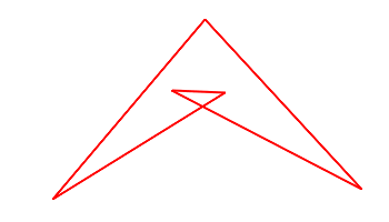
Below there is a simple example. First I show a self-intersected polygon. Second I show the same polygon filled using the alternative mode. As you can see, a colateral effect of this technique is that, in this case, the polygon is not completely filled. Finally I show the winding mode applied to our polygon. It has the behavior we usually want in this situation: the polygon is totally filled.


Subscribe in a reader

Friday, December 11, 2009

Vector drawing library

I lot of people ask me how I make Picture to People. Well, I develop P2P by using my own graphic libraries I create from scratch.

One of my newest libraries is Maccala, a vector based rendering library with professional anti-aliasing e many advanced features. I have been developing it intensively for the last 2 years.

Having this library in hand, I could develop even more advanced features like my own font rendering engine.

If you are a software developer or are just curious, you could like to visit the page about Picture to People vector based drawing library. This URL has many interesting sample images.

Subscribe in a reader